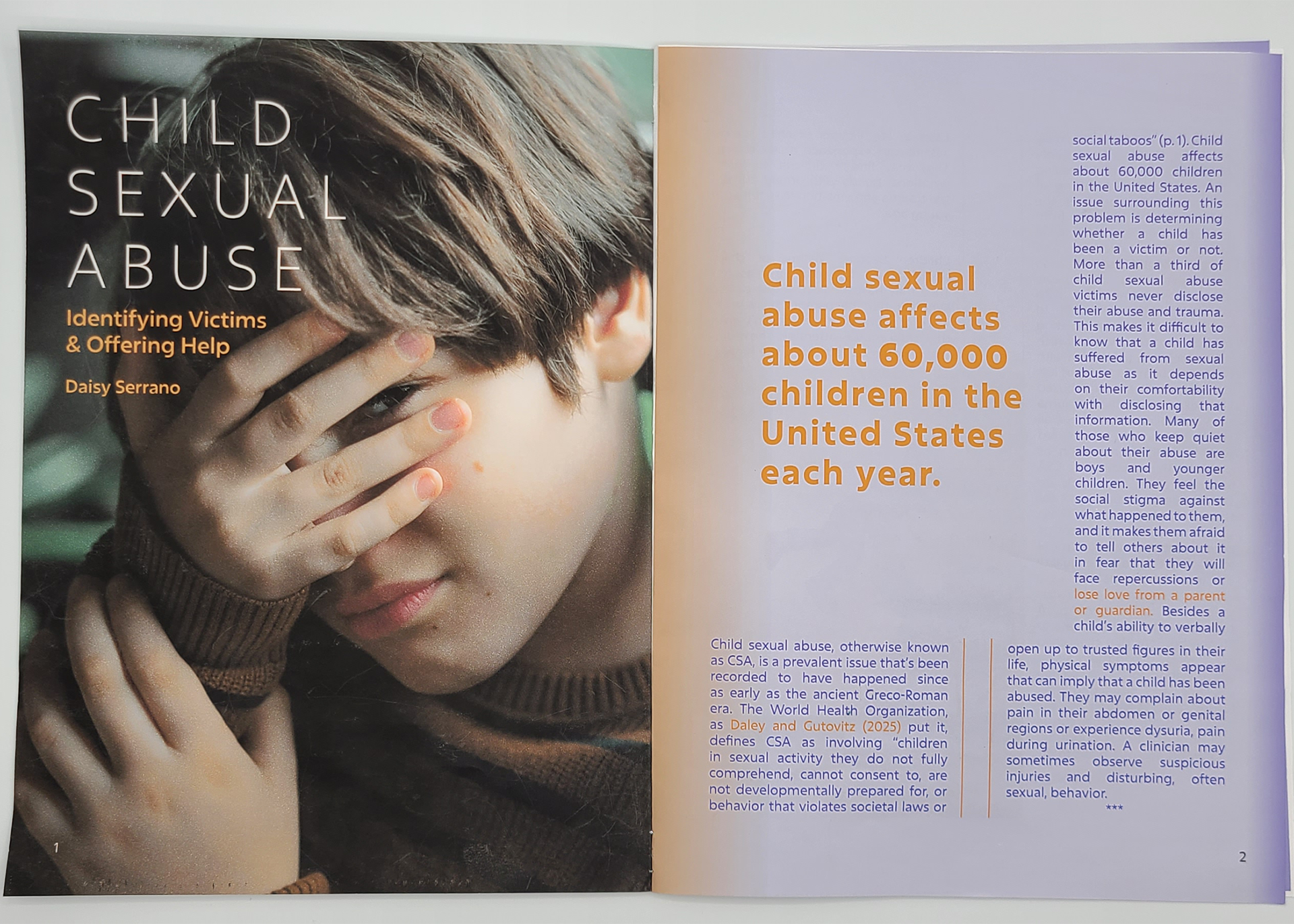
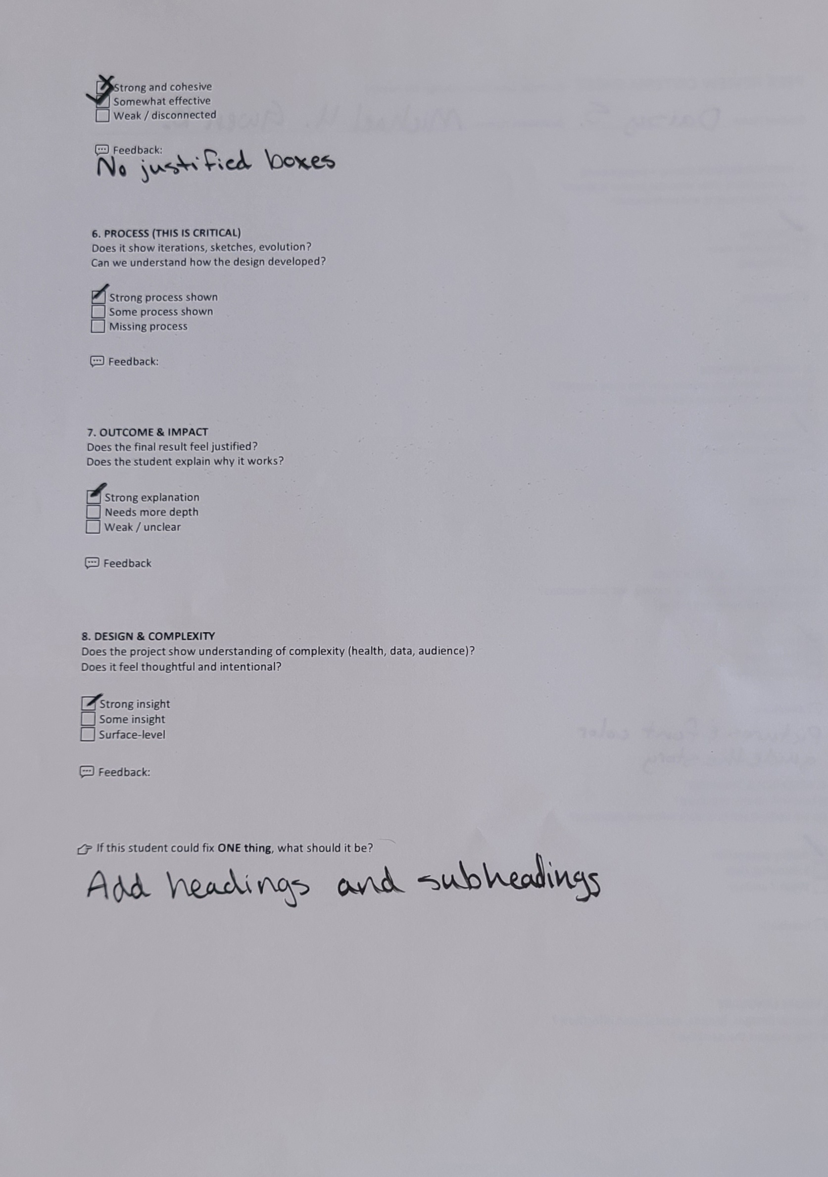
There are many points in time where a child’s safety can be threatened. Child sexual abuse, or CSA, has been a long-standing issue since the Ancient Greco-Roman era. The World Health Organization, as Daley and Gutovitz (2025) put it, defines CSA as involving “children in sexual activity they do not fully comprehend, cannot consent to, are not developmentally prepared for, or behavior that violates societal laws or social taboos” (p. 1).
It is crucial for parents and guardians of children to be informed about child sexual abuse because of how prevalent it can be. Around 60,000 children in the US experience CSA a year, so it’s important that victims receive the care and help they need. After my research, I concluded that I needed to provide information that could prepare parents and guardians of children to prevent as much as they can and aid victims in what they need. As a designer, I have the ability to deliver information in a visually appealing way through usage of research and layout design. I recognize the ways that color, shapes, and type affect the tone of the information, so I can use this to make sure the appropriate tone is conveyed through my design.
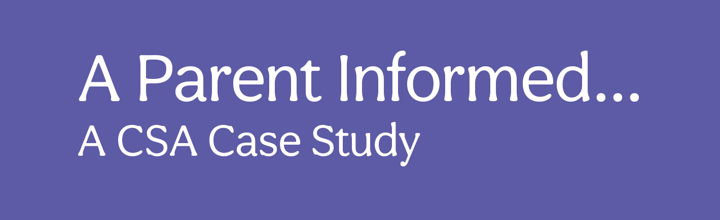
The purpose of this magazine is to introduce unknowing parents and guardians about CSA so that less CSA victims suffer in silence due to not feeling safe enough to open up to an adult. By informing parents and guardians of children on CSA and its effects, I aim to increase their vigilance towards their kids.


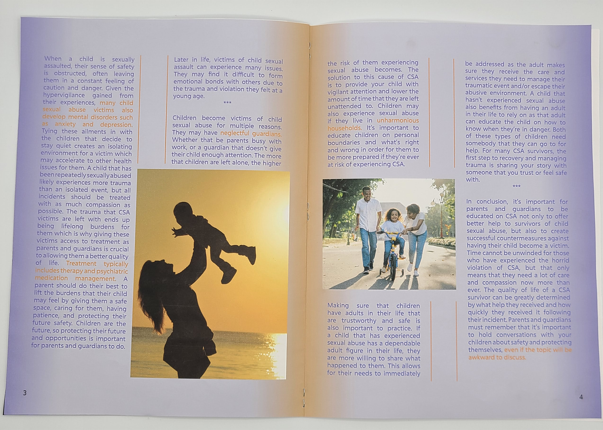
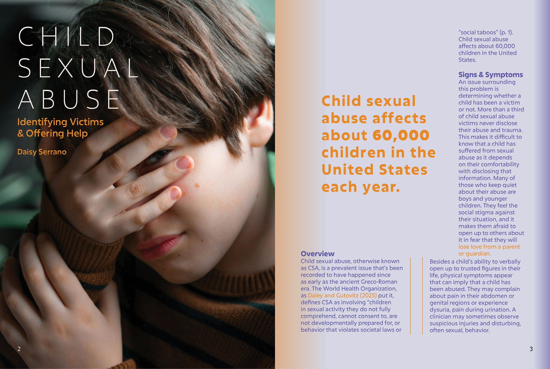
My research was shaped by the experience that victims of child sexual abuse have gone through. My research consisted of scholarly articles and journals published by reputable sources such as the National Library of Medicine. My data made it clear that many victims of CSA feel isolated, showing the prevalence of lack of a support system. Thus, it was crucial for me to stress this aspect of treatment and prevention of CSA in order to address the gap in trusted figures in children's lives.


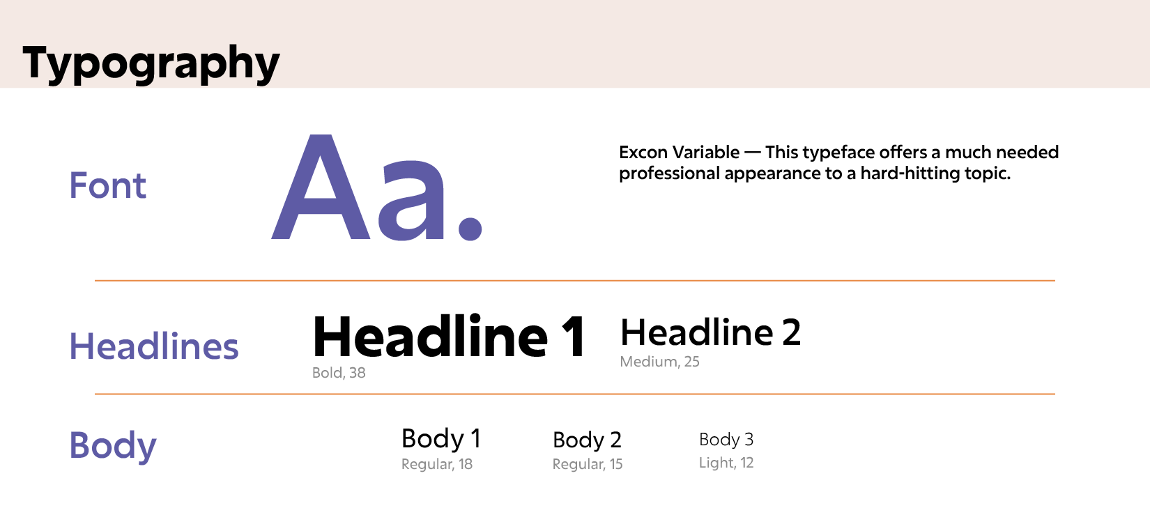
This article was designed to convey the severity of the issue along with the sorrow of the victims. I did this by using purple and orange. The tone of the article was meant to be informal, but compassionate. This is a very sensitive topic, so sounding empathetic of any victims that may be reading is important. As this is also a health issue, it was important for me to deliver the information concisely to my audience of parents and guardians. I know that I needed to find a middle ground between credible design and interesting design, and I did so by using less vibrant colors for professionalism and thin rectangles in between columns of text for organization.


Over time, this article gradually gained its own identity unique from the reference spreads taken from a WIRED magazine. I immediately strayed from the sketched layouts once I reached InDesign for the title page. I felt that a full page image would be more impactful and visually interesting than a smaller image. The initial sketching and measuring process was relatively challenging to deal with as this was my first experience working with picas.
Sketch Spread 1
Sketch Spread 2
Printed Spread 1 Draft
Printed Spread 2 Draft
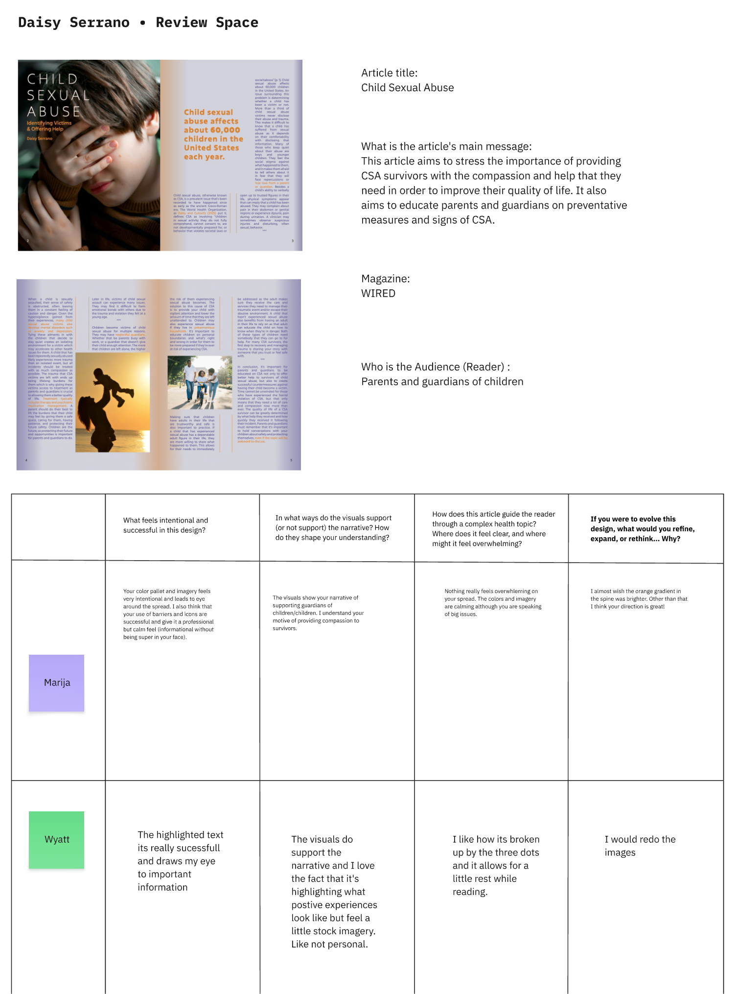
First Critique
Second Critique


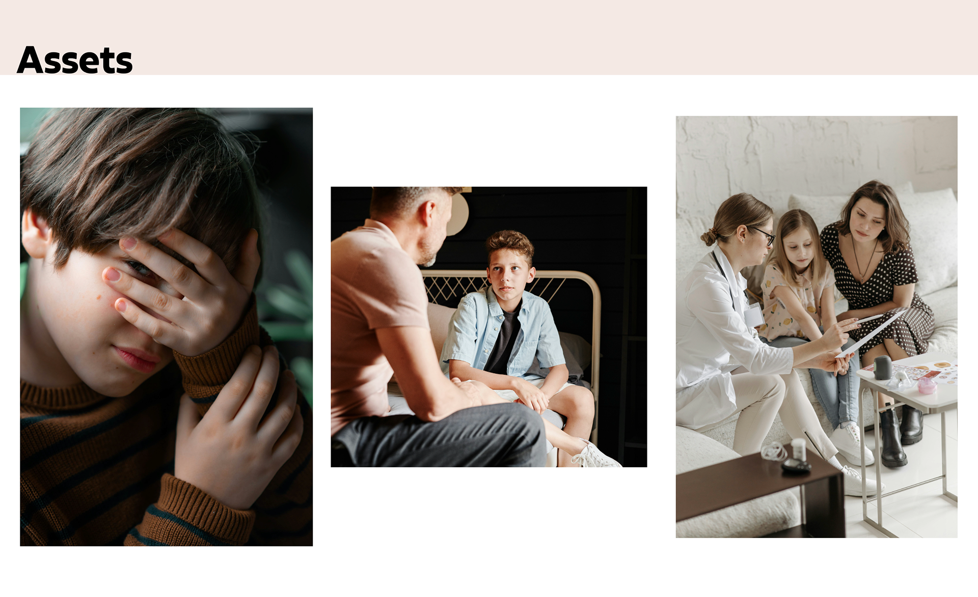
My final spreads incorporated the feedback I received. I changed the justified alignment to left alignment, separated the body text by adding subheads, and changed the photos to match the tone and topic better. These changes allowed for my final article to appear more cohesive and organized both narratively and visually. I felt challenged by having to adhere to the style of the reference spreads, so straying from that style helped me solve this problem.
First Article Spread.
Second Article Spread.
Throughout this project, I gained insight on the magazine design process. In a professional setting, each stage of the magazine's development would be assigned to its own person. By completing each stage myself, I understand more what the work environment of magazine designers and editors looks like.